Sizzle App - product design
Role: Product designer & illustrator
Team: Three designers, Pratt Digital Product Design Class 2018
Duration: 13 weeks

Brief
In 2018 I took a product design class at Pratt Institute to expand my knowledge of user-centered design. The class aimed to teach us to collaborate and build a product from start to finish.
Our only instruction was to choose an industry to build a product for. A group of three designers, we were interested in either food or education, so decided to create a product that would address both: Help people develop healthy eating habits plus educate them about what they’re eating, preferably in an enjoyable way. The marketplace is saturated with cooking, diet and health apps, so we researched competitors and potential users to understand how to make our product improve on what's already out there.
Research & Process
Competitive analysis
User Interviews
Affinity mapping
Design studio
Usability testing
We started by looking at dominant apps to get an idea of what’s out there, particularly looking at Yummly, Daily Harvest, Food Planner.
From conducted user interviews we discovered that while the eating habits of every user are different, all users had an idea of what they would have liked to improve in their existing diet: cut junk food, reduce sugar, lower cholesterol, etc. This helped us to define our problem statement:"How do we improve the way people prepare healthy food?"
When we started brainstorming solutions in a design studio, we came up with many ways to helps our users: basic recipes arranged by dietary preferences, a weekly planner, budget calculator, shopping lists, camera technology that scans refrigerator/pantry and tracks inventory, coupons at local grocers and more.
We started thinking of the main job stories to address. We created a basic on-boarding process to gather users preferences. This would allow us to customize solutions based on their choices. We added illustrations to make the process more enjoyable.
We focused on learning dietary restrictions, allergies, cooking skills, food likes & dislikes and user goals. We took those lo-fi prototypes and started testing them on users.
Critique + Prototyping
Our next step was to bring all of our findings to a group critique. What became clear to us was that users were interested in a tool that would help them cook, but additionally help them achieve individual dietary goals. "I'd love to have a tool that would help me eat less junk" "I'd love to have an omega 3 rich diet".
We realized that if we build a tool that narrows down recipes based on dietary preferences + helps our users reach their personal goal in a measurable way, we'd have a great product AND the thing that would separate us from similar health/recipe apps that ruled the marketplace. We had so many ideas! but time was running out and we needed to focus.
We narrowed our product's focus to 3 main categories:
Cook - Filtered Recipes according to user preferences after completing the on-boarding process. This would include helpful information, facts and tips.
Shop - Phone camera powered inventory scanner to help user track what they currently have in their kitchen and what needs to be bought.
Goals - A goal tracker to measure defined goals based on a weekly meal plan that the app will track. Additionally, saved health tips, recipes and info gathered from on-boarding or entered manually.
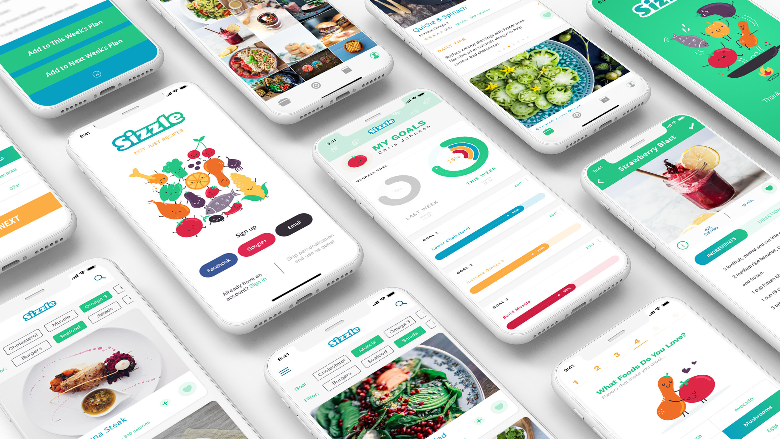
Visuals
Now that we had a clear idea of what our app is all about it was time to give it the beautiful face it needed. We wanted a clean and modern look and an appetizing one. We created the style library: chose colors, shapes, fonts and imagery. We colored and streamlined the on-boarding illustrations adding an emotional component when being guided through.
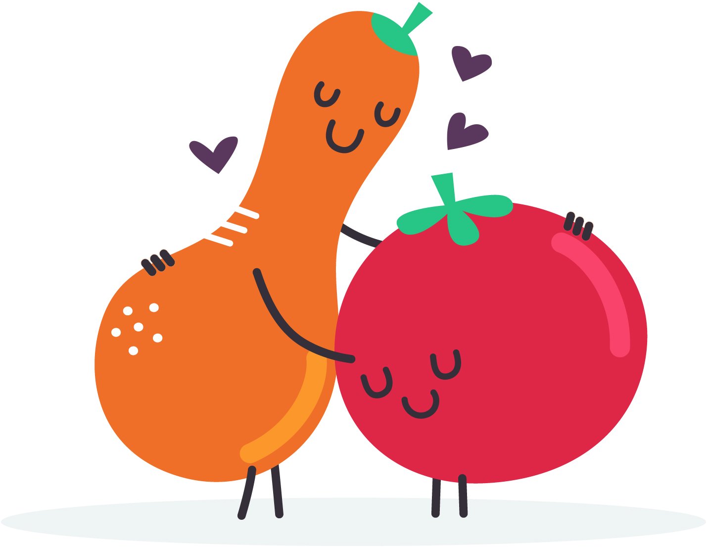

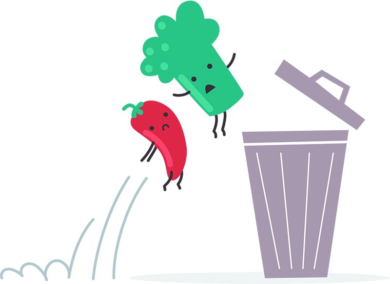


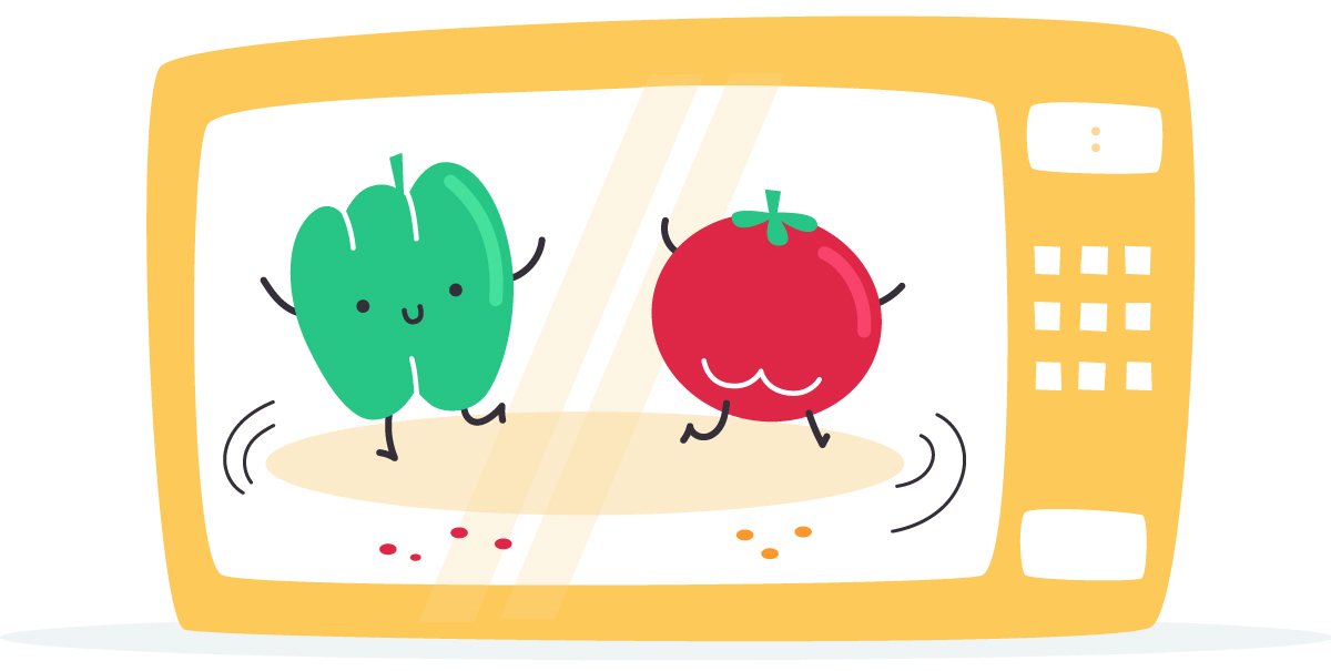
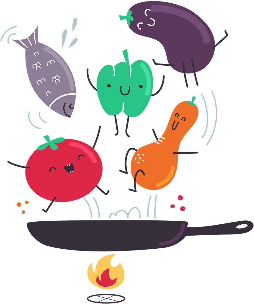

Unique contribution - Illustration
Every designer brings their own background to the table when working in a team. In my case, it was my time spent as an illustrator that allowed me to add an emotional component to the on-boarding process through food based characters. These add personality and help direct users in their first steps in the app,
Tweaks and final Product
For the end product we changed the navigation to include:
Recipes - narrowed down by preference, the recipes + health tips are storable for repeated use. This section would also include a short explanation about how to use the app
Goals - Showing a weekly tracker of your goals, combined and separated. It would also show your saved health tips
Planner - potentially showing your weekly meal plan
User - Where you'll see all of your info and saved recipes
Since our Goal tracking system was based on the planning of users meals, we created a planning and notification system:
meal selection, scheduling it by day and time and clickable reminders that add the meal to the goal tracker.
A quick presentation of the product design process is available here.
Takeaways
What we learned:
User is everything - Even though we thought we knew what we wanted to achieve with this app, user testing made us shift from what we thought we knew, to what the user actually needed
Feedback is key - along with user testing, peer feedback during class proved essential in making sure we’re being cohesive and looking at our work from all possible angles
Working as a team - every designer brings something to the table. In my case it was illustration and visual components, another brought UI chops, and the third had a knack for copy. Combined, the sum was much greater than the individual particles
Owning a product - along the way there were moments when we felt unsure of what we’re doing, unsure if the process works. But following the guidelines the project materialized in from of us and it was a true pleasure to own to its every detail
What could be improved:
Presenting the process is an important part of explaining why we made the choices we made. While our product presentation was good, the story of how it came to be was really lacking.
Because the process of creating a product from start to finish includes a lot of information, I felt that building a single product was insufficient, and would have loved the opportunity to practice more
Even though relying on our diverse backgrounds and personal skills was the smart thing to do with the time restrictions we had, I wish we could have afforded to mix it up a bit so that every designer could have practiced all aspects of design at least to some degree